Microsoft
Sr UX Designer Contractor | 2022-2023
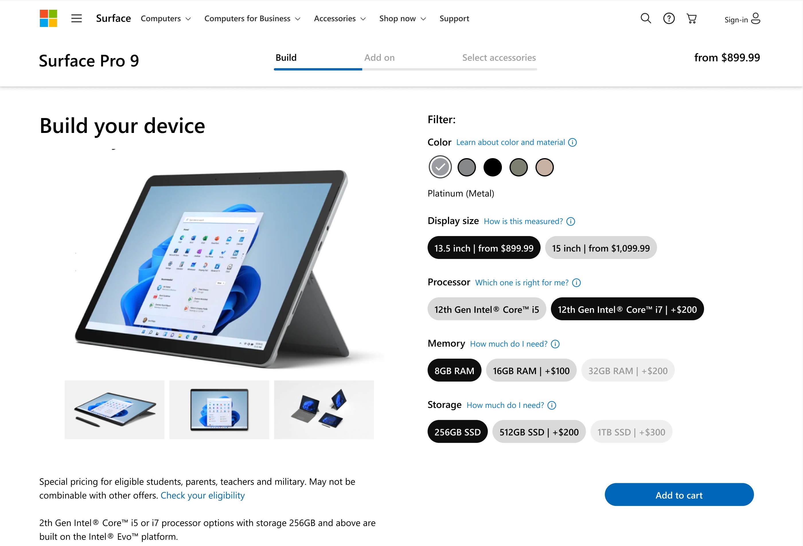
The configurator design needed a modern refresh. How might we educate users about product features and simplify the process when shopping for a Surface?
PAIN POINTS:
On desktop, users frequently clicked on the image, indicating that they expected to see additional or expanded images
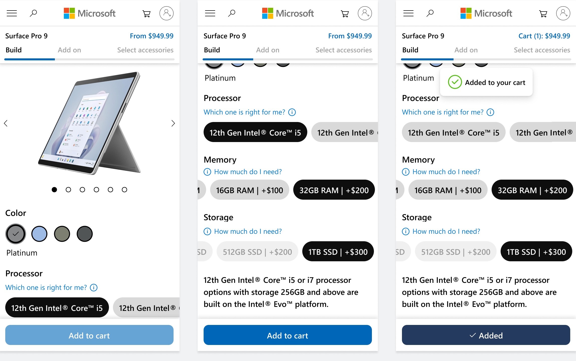
On mobile, the color picker was placed so far away from the image that users had to scroll up and down to see the color on the device.
The existing UI offered eleven (but not all) possible keyboard options in a carousel. This made it difficult for users to easily find the best deal and preferred color.
The summary in the right column takes up a lot of space summarizing the previous screens.
My design proposal featured:
a larger image gallery
rounded-corner filter tiles with a lighter outline
updated progress meter in the right rail
cart preview toast when items are added
a sticky progress bar with a persistent cart summary
an automatic vertical scroll to advance users through the device builder.